Showing posts with label lettering. Show all posts

Monday, November 17, 2014

New book: DAIM - his first 25 years of work now in print

Mirko Reisser (DAIM) [book]: 1989 – 2014

DAIM's new book is a retrospective covering this graffiti master's first 25 years of work. Daim's 3D graffiti styles continue to amaze viewers worldwide.

320 pages! And just in time for the holidays.

English and German text and full-color artwork.

Read more about this book, and find out where to buy it, on Daim's website.


Also, if you'll be traveling to Bern, Switzerland soon, check out his Monomania exhibition there -- up until January 10, 2015.

Sunday, November 2, 2014

Call for artists: THE ART OF THE BLACKBOOK (pop-up show in California)

WORK_SPACES PROJECT & GIFT TO GAB 
presents

THE ART OF THE BLACKBOOK
pop-up group art show

ARTIST CALL

http://workspacesproject.blogspot.com/2014/10/workspaces-project-gift-to-gab-presents.html

(You don't have to be in California, but your artwork does.)

Wednesday, August 27, 2014

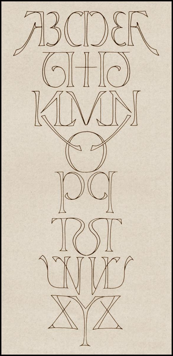
Mirrored alphabet

https://pbs.twimg.com/media/BvDjx4xCYAMpAYt.jpg

Regrettably, I can't find the origin of this, but it's lovely and I wanted to share it.

Tuesday, June 25, 2013

Italy, Bellagio: July 5-15, 2013: FLYCAT Skriptoria


Torre delle Arti, Bellagio-Lake of Como, Italy
opening: July 5th from 5 pm

Wednesday, May 29, 2013

Italy, Venice Lido: May 16-June 10, 2013: FLYCAT


SKRIPTORIA

“Nuovo Rinascimento Scrittorio”

Fù San Benedetto ( IV sec. d.C.), fondatore dell’omonimo ordine dei benedettini che volle in ogni monastero si redigesse una biblioteca, nacquero così anche gli ‘scriptoria’, laboratori atti alla realizzazione dei codici miniati. Rappresentavano un punto di convergenza tra la scrittura, la decorazione e l’illustrazione in una armonizzazione delle sue parti che ne puntualizzavano il valore.

Sotto il regno di Carlo Magno (VIII sec.) viene attuata la ‘riforma scrittoria’, o ‘rinascita carolingia’ dove viene imposto un modello di scrittura omologato soggetto a limitazioni come l’eliminazione delle legature tra le lettere ed anche di molte abbreviazioni, questo per facilitarne la comprensione e quindi la divulgazione dei testi con essa realizzati, uno stile decisamente manierista : la ‘minuscola carolina’, per poi cadere in disuso durante il basso medioevo in favore della scrittura gotica ed essere poi ripresa dagli umanisti diventando poi la base dei moderni caratteri di stampa.

Dal XIII secolo il patrimonio delle ‘lettere’ smise di rappresentare un esclusivo monopolio da parte del clero, con l’ ‘Umanesimo’ ed il ‘Rinascimento’ grazie alla crescita delle università, la pratica scrittoria e con essa quella della miniatura divennero anche una disciplina della laicità. Con questo passaggio le ‘lettere’ vanno arricchendosi di forti elementi ornamentali e di figure zoomorfe che ne vanno ad irrobustirne la struttura.

Nel XX secolo, le ‘lettere’ ritrovano la loro energia e si liberano dagli schemi e dai vincoli a cui erano state assoggettate, ha inizio un 'Nuovo Rinascimento Scrittorio', dalle oscurità del sistema metropolitano delle moderne metropoli diramandosi come un virus attraverso le reti di trasporto sotterraneo mondiale.

Quelli che un tempo erano eretti nei monasteri ora sorgono nei tunnel delle metropolitane. Gli antichi ‘scriptoria’ si liberano del vincolo alla terza lettera ‘C’ e sostituendola con la lettera “K”, la 21esima dell' ordine, si tramutano in “SKRIPTORIA”. Dapprima le carrozze dei treni divengono le nuove pergamene sulle quali imprimere i nuovi codici dissacranti di una nuova riforma artistica, poi grazie ad una volontaria emersione anche degli spazi aperti per così poter essere lette e riscritte da un più vasto pubblico.

Le 26 lettere dell’ alfabeto latino romano rappresentano altrettanti 26 eserciti formati da truppe di contemporanei monaci guerrieri ( dal greco monachos, persona solitaria) , pronti a combattere per la tutela e la salvaguardia del potere delle lettere.

Come portavoce di questo 'Nuovo Rinascimento Scrittorio', in qualità di allievo del Gran Maestro The Ramm:Ell:Zee e rappresentante del Panzerismo Ikonoklasta e del Futurismo Gotico, posso affermare che traggo anche ispirazione dal Movimento Futurista consacrato con il suo Manifesto nel 1909, trovando in particolar modo nel suo punto 3 una forte sinapsi: La letteratura esaltò fino ad oggi l'immobilità pensosa, l'estasi ed il sonno. Noi vogliamo esaltare il movimento aggressivo, l'insonnia febbrile, il passo di corsa, il salto mortale, lo schiaffo ed il pugno.

Le mie lettere sono dotate di un armatura che le protegge e che le abilita al combattimento per la preservazione del linguaggio e della conoscenza, il loro potere sta anche nella libertà di movimento e nella dinamicità , quì non è più importante il valore grammaticale della 'formazione' che le lettere costituiranno ma l'essenza sta in ogni singola struttura-lettera.

http://manniartgallery.com/ La mostra è aperta fino June 10

English:

SKRIPTORIA Manifesto 2013
"New Writing Renaissance"

It was San Benedetto (IV century AD.), Founder of the Benedictine order who in each monastery prepared an assessment library. So were born the 'scriptoria', laboratories for the production of illuminated manuscripts that represented a point of convergence between writing, decoration and illustration in a harmonization of its parts that emphasized its value.

Under the reign of Charlemagne (VIII sec.) Is implemented the 'scribal reform', or 'Carolingian Renaissance' is imposed where a model of writing approved subject to limitations such as the elimination of ligatures between letters and also of many abbreviations, this in order to facilitate the understanding and thus dissemination of texts with it made one very Mannerist style: the 'tiny carolina ', then fall into disuse during the Middle Ages in favor of the Gothic script and then be resumed by the humanists and was later the basis of the modern characters printing.

From the thirteenth century, the heritage of the 'letters' ceased to be an exclusive monopoly by the clergy, with the '' Humanism 'and' Renaissance 'thanks to the growth of universities, the scribal practice and with it that of the miniature also became a discipline of secularism. With this step the 'letters' are enriched with strong ornamental elements and zoomorphic figures that go to strengthen the structure.

In the twentieth century, the 'letters' regain their energy and are released in the schedules and constraints which they were subjected, began a 'New Renaissance Writing', from darkness the subway system of the modern metropolis branching out like a virus through transport networks underground world. Those that were erected in monasteries now arise in the subway tunnels. The ancient 'scriptoria' get rid of the constraint on the third letter 'C' and replacing it with the letter "K", the 21st of 'order, are transformed into "SKRIPTORIA".

First train cars become the new scrolls on which give the new codes desecrating a new artistic reform, then, thanks to a also voluntary emergence of open spaces so they can be read and rewritten by a wider audience.

The 26 letters of the 'Roman Latin Alphabet represent as many 26 armies composed of troops of contemporary warrior monks (from the greek monachos, solitary person), ready to fight for the protection and preservation of the power of letters.

As spokesman for this 'New Renaissance Writing', as a student of The Grand Master: The Ramm: Ell: Zee and representative of the Ikonoklast Panzerism and Gothic Futurism, I can also say that I draw inspiration from the Italian Futurist Movement consecrated with his Manifesto in 1909, finding in particular in its point 3 a strong synapses: The literature to date exalted thoughtful immobility, ecstasy, and sleep.

We want to exalt aggressive action, a feverish insomnia, the step of running, jumping deadly, the punch and the slap. My letters are equipped with an armor that protects them and which enables them to fight for the preservation of language and knowledge, Their power also lies in the freedom of movement and dynamism, here is no longer important grammatical value of the 'training' that the letters constitute but the essence is in every single frame-letter.

http://manniartgallery.com/ The exhibition ends June 10.

Monday, March 11, 2013

New Book: Flip the Script, A guidebook for Aspiring Vandals & Typographers

This book is a monumental collection of graffiti lettering and regional styles. It is the first serious attempt to catalog lettering and alphabets in the USA in a systematic way. Although no survey of styles will ever be complete, it's a worthy effort that lays down an important visual historical foundation.

Hand styles, tags, histories, interviews ... this book has it all. This is an epic addition to graffiti history and to typography studies, brought to you by Christian Acker of http://www.handselecta.com

Anyone who's done their homework will recognize the names of the writers whose knowledge and hands grace this book. It's the kind of book that only someone who knows what's up can write.

It's the size of a traditional blackbook with a rugged textbook-style cover, high-quality paper, and a satin, sewn-in bookmark appropriate to its seriousness as a working reference for the lettering-obsessed. 

- Susan

http://christianacker.tumblr.com
http://gingkopress.com/05-str/flip-the-script__gra.html
http://www.amazon.com/Flip-Script-Christian-P-Acker/dp/1584234601/


Gingko Press in association with Upper Playground is pleased to announce the release of

FLIP THE SCRIPT: A Guidebook for Aspiring Vandals and Typographers.

Graffiti is one of the last strongholds of highly refined, well practiced penmanship in our contemporary culture. The tag, that most reviled and persecuted form of graffiti, is seldom appreciated for its raw beauty and skeletal letter forms. The casual viewer seldom discerns the difference between entry level and advanced hand styles.

Within the pages of FLIP THE SCRIPT, author Christian Acker systematically analyzes historic hand styles by collecting the work of writers from the most influential American cities and searching for the origins and commonalities that connect people, places and times. While distilling years worth of interviews with graffiti writers from all over the country, intersecting tales emerge that reveal a web of unwitting connections and influences.

FLIP THE SCRIPT has captured a representation of geographic differences within contemporary folk-art history; a history rapidly becoming muddied by internet culture. Acker presents the lettering samples in a clean, chronological format, for the first time giving the material a formal treatment evocative of classical calligraphy manuals and typography books.

FLIP THE SCRIPT includes art and interviews from luminaries such as: TAKI 183, STAY HIGH 149, HAZE, CORNBREAD, ESPO, AGUA, RENOS, GREY, DUGONE, MIKE GIANT, CHAZ BOJORQUEZ, SLICK, & CRAIG STECYCK.

224 pages, Hardcover, 8 ̋ x 10.5 ̋ (178 x 229 mm) 100s of 2-color illustrations, English ISBN: 978-1-58423-460-9 Retail: $ 35.00
Publication Date: 3.8.2013


Saturday, October 27, 2012

AZ, Phoenix: Nov. 3, 2012: Hip-Hop at MIM with DJs QBert & Radar, Such & Champ + FSC


Nov 3rd, 9am-5pm

Musical Instrument Museum
4725 E. Mayo Blvd, Phoenix AZ 85050
(corner of Tatum and Mayo Blvds, just south of Loop 101)

Event includes featured artists in the new exhibit: Such and Champ Styles and DJ QBert, Legendary Scratch DJ! Plus DJ Radar and FSC back again for 2nd year in a row!

Free with museum admission.

Purchase tickets in advance at www.themim.org or call (1) 480.478.6000

Monday, October 22, 2012

Norway, Stavanger: Sept. 29-Nov 18, 2012: Nuart Festival

www.nuartfestival.no

Tou Scene Ølhallane. Kvitsøygata 25. Stavanger, Norway
SEPT 29-NOV 18TH 2012

Exhibition opening times Tues-Fri 1100-1700. Sat & Sun 1200-1600 Free Entry.


Nuart is an annual international contemporary street and urban art festival established in 2001 with a focus exclusively on Street Art since 2006. The Festival is based in Stavanger on the West Coast of Norway.

Each September an invited international team of street artists start to leave their mark on the city's walls, both indoor and out, creating one of Europe's most dynamic and constantly evolving public art events.

Saber, Shoe, Ron English, How & Nosm, Eine, and more!

Monday, August 20, 2012

Monday, June 11, 2012

UK: London: June 15 - July 14, 2012: THE CHROME ANGELZ


The Chrome Angelz

MODE2, ZAKI, SCRIBLA, PRIDE, BANDO

The Outsiders gallery
Greek Street, Soho, London

from Friday June 15th until Saturday 14th of July

Do not miss this historic occasion! 


Sunday, May 13, 2012

France, Bordeaux: May 19 - June 16, 2012: Kay One


L'Envers vous convie à la première exposition solo de 
KAY ONE "CASH BRIBES ONLY
//// EXPOSITION : du 19 mai 2012 au 16 juin 2012 ////
//// Début des festivités en présence de l'artiste : Samedi 19 mai à 18h ////

Kay One a commencé à peindre en 1984 après avoir découvert le Graffiti aux États-Unis.

C’est en 1985, pendant les années d’or de ce mouvement, avec le fameux terrain vague de Stalingrad à Paris que KAY ONE rencontre les artistes qui feront partie de sa “famille”, les TRP (The Renegade Painters) dont notamment BANGA et SAN. Il multiplie alors les collaborations avec de nombreux «Graffiti writers», entre autres MODE 2 et BANDO.

En 1986, il rencontre les TKC (The Kool Crackers) puis peint avec les NTM (Nique Ta Mère) qui lui présenteront les 93 MC (93 Mafia Crew) avant de fusionner avec ces derniers, faisant de 93 NTM le groupe le plus remarqué de sa décennie.

Afin d'illustrer au mieux cette modeste exploration de la culture Hip-HOP, l'exposition sera jalonnée, tous les samedis, d'interventions amicales de divers artistes.

du body-painting avec le SKINJACKING (Bordeaux) de l' aérographie avec BANGA (Paris), de la photographie avec ALAIN GARNIER (Paris)
et SABINE GRENET (Bordeaux), et, comme d' habitude à L' ENVERS, des fanzines et du tatouage...

CASH BRIBES ONLY
une exposition-vente de KAY ONE du 19 mai au 16 juin 2012
de la musique, des projections

ouverture:
samedi de 17h à 22h mercredi de 14h à 18h et sur rendez-vous

L' ENVERS
19 rue leyteire 
33000 
bordeaux 


France, Paris: May 15, 2012: Bates and Niels Bjorndahl

Wednesday, May 9, 2012

Wednesday, April 18, 2012

The Demoscene: hackers making "digital graffiti" - Moleman 2 and Farbrausch

The computer hacker scene, particularly the demoscene, is one of the closest analogs to the graffiti community. In the demoscene, hackers crack games and write all over them with clever graphics and hand-drawn lettering, all done in machine language. (Machine language is code just talking to the chips without any of that fancy high-level computer language or 3D software application getting in the way.) The result is elegant, small, fantastic, and battle-ready. And demo crews do battle. Regularly, for decades now.

There's a new documentary about it, called Moleman 2 (free, complete, on YouTube, see below).

But first, to whet your appetite, below is a 2007 winner by Farbrausch, who just released some juicy sourcecode on Github.


Here's the elegant part: This video's original is a 180k snippet of code. One digital photo on your phone is likely 25 times that size! This blog post is probably bigger than 180k. And there's lots more where that came from. Check the relateds and do some searching.

If you only have 10 minutes: (Click "CC" to get English subtitles.) Here's the best overview Moleman has about the lettering: http://www.youtube.com/watch?v=iRkZcTg1JWU&feature=youtu.be&t=50m It's not the best ever done, but you get the idea.


The entire Moleman 2 documentary

Tuesday, April 3, 2012

OR, Portland: April 7, 2012: Sticker Phiends 5

Printed Matters

The Slate/Scion Gallery
2001 NW 19th Ave, 104
Portland, OR
Presented by: Mike "Mad One" Neely II

April 7th 2012
7-11pm

Printed Matters is a group print show hosted by the infamous Sticker Phiends.

Anthony Lister
Aroe/MSK
BigFoot1
Codak
Cope 2
Chris/RWK
CopyRight
Dain
DumperFoo
Evoker 1
Griffin 1
Hmph/Kento
London Police
Mad One
Mr. Brainwash
Nate Luna
Pez
Phresha
Seizer
Sike'
Slick/Dissizit
Shepard Fairey/Obey
Two Rabbits
Voxx Romana
Ultra
& MANY OTHERS!!

All Ages!
FREE Handouts provided by our sponsors & artists
21+ID= Drinks
& Much More!!

Thursday, March 8, 2012

Boa Mistura in Brazil and their optical illusions

The illusions of Boa Mistura seem to build on some of the many-wall pieces seen in gallery installations in recent years that combine to form a word when viewed from a vantage point. It's likely to stop people in their tracks. (Thanks to Brinda for the heads up on this.)

As far as I know, this technique was pioneered in wall graffiti by the very talented Portuguese writer, Odeith many years ago. Odeith does many complex 3D wildstyle pieces that float off the wall visually when viewed at the right angles. He calls his technique "anamorphosis". He has a HoF in Lisbon covered in his work.

In traditional fine art, this sort of effect is called "trompe l'oeil", which means "deceive the eye", in French. (It is pronounced much like the spelling, tromp-low-eey, with the emphasis on the last syllable). Generally it "breaks the picture plane" by appearing to emerge from the flat frame and it dates back to at least the Greeks, Romans, and Pompeii.

Yahoo images turns up some amazing murals and street art in trompe l'oeil.